5 Home Page Design Mistakes That Are Costing You Business

As one of the first things that potential clients will see when researching your company, your website home page is of utmost importance to your marketing strategy. This is where you build your brand and show the world who you are and what you stand for. It's your chance to make a good first impression and get people interested.
If you're thinking that there seems to be a lot riding on your home page design, you would be correct. How you structure your home page can make or break your online marketing approach, and a simple design error can cost you leads and, consequently, money.
For that reason, it's crucial to have a home page that's easy to navigate and which fully engages your target audience. Furthermore, if what they see doesn't provide them with calls to action and sufficient information about your company, prospective customers might get frustrated and give up on connecting with your company altogether. That's the thing about the internet: it's easy to close out and move on to other options if you don't immediately find what you're looking for.
What makes a home page appealing? Or, perhaps more relevant, what are some common mistakes that contractors make in designing their home pages?
Think about some of the websites you've visited recently. What stuck out? How would you describe the web design? You might describe some sites as "busy", "confusing", or "outdated", while you'd characterize others as "vibrant", "professional", or "welcoming".
Given these descriptions, it's clear which type of website you'd prefer to use. This assessment can also have an impact on how willing you are to trust the company and do business with them in the future. More likely than not, you wouldn't hire a company whose web page lacked legitimacy and clear instructions for taking the next step.
Read on for five common web design mistakes that could be hurting your contracting business.
What's Wrong With My Home Page?
Some of the most frequent web design blunders aren't as obvious as one would think. As such, many contractors don't realize the effect that certain design decisions can have on visitor perceptions. This list provides a non-comprehensive look at several common home page design errors.
1. There's too much clutter.
For most business home pages, it's true that "less is more". Visitors don't want to be bogged down by too much information or a jumbled mess of words and images. The typical web users wants to have quick and easy access to whatever information they're seeking, whether this includes your contact details, your company's history, or testimonials from past jobs. If the website is too busy, this information becomes hard to obtain, and users are likely to get discouraged.
The best home pages are those which are simple and clean-looking, and which offer visitors an easy means of accomplishing whatever they came to your site to do. Leave out anything that might be unnecessary, and focus on the user experience. Don't forget to include an area where visitors can opt in for more information or request an estimate.
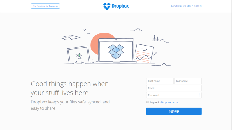
The Dropbox home page is a great example of a page that is uncluttered and user-friendly. Note that only the bare minimum is provided: a brief description of the site's uses, a few calls to action, and a sign-up form.
2. There's no clear headline.
Your home page headline is an important indicator of what your company is all about. So when your page doesn't have a headline, or the headline isn't immediately apparent to visitors, there might be some confusion as to the purpose of your business.
A lot of businesses also make the mistake of having a headline that is too company-centric -- that is, it tells you about the company, but not about what the clients have to gain from hiring that company or buying the product. These tend to be "we" statements as opposed to "you" statements. As a result, customers don't feel as though their concerns are your number-one priority. Your headline should illustrate that the services you offer are capable of meeting client needs.
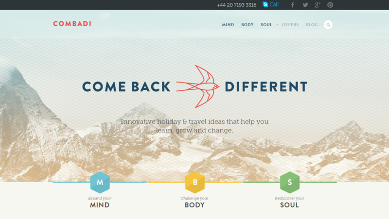
Combadi's website headline is not only extremely easy to identify; it's also very clearly focused on the user and how they can benefit from the company's services.
3. There's no primary image.
Generally speaking, people are highly visual. We base our perceptions on what we see, and we do judge books by their covers. As such, the "cover" of your website needs to be sufficiently appealing and interesting to users. We recommend using one main image to maintain simplicity and keep your home page looking neat and organized.
You should also make certain that the primary image makes sense in relation to what your company does. Choosing a vibrant image that has nothing to do with your company's objectives will only add to the user's confusion. From your image, visitors should be able to make an educated guess as to what type of product or service your company provides.
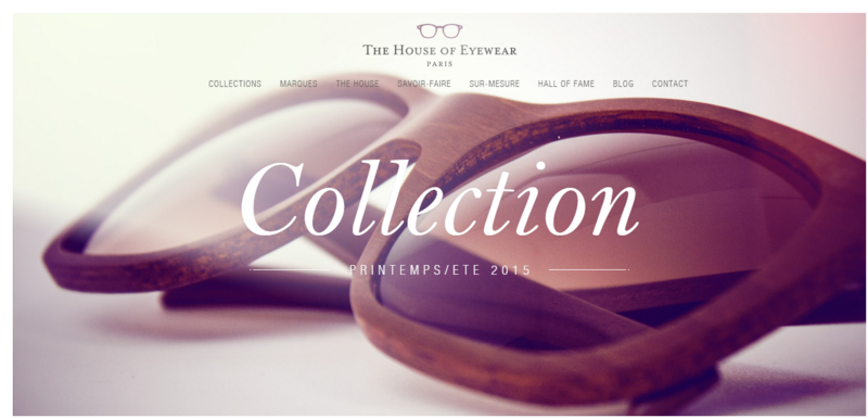
Check out the House of Eyewear home page. Right away, it's obvious what the purpose of the company is.
4. It lacks order.
We can't say it enough: simplicity is key. If your home page seems too difficult to navigate, its click-through rate is probably going to be pretty high. Create a home page that is well-organized and easy to get around, with labels and clear directions for what to do next.
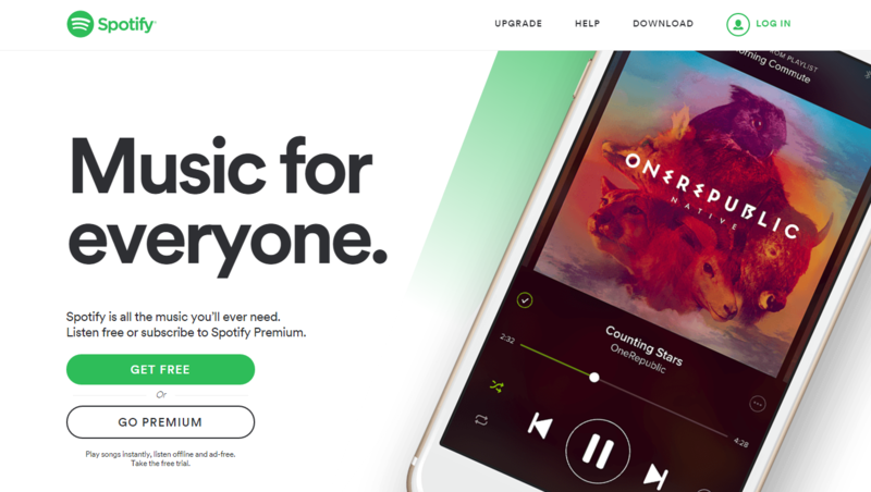
One company that has this down pat is Spotify. Note that their home page is very straightforward in terms of navigation: users can instantly determine how to log in, sign up, or get help.
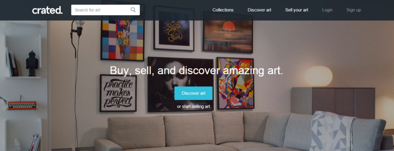
5. The logo is too big.
This may very well contradict everything you thought you knew about marketing. But in the end, customers don't really care about your logo. They want to know what your company can do to meet their needs. As in the case of using a company-centered headline, having a logo that's too large or overbearing can detract from the customer experience by suggesting that you care more about selling your brand than making your clients happy.
You shouldn't exclude your logo altogether, but don't make it the focal point of your home page. Develop a headline that is relevant to your target audience and focus on that, instead.
You'll notice that, while the Crated logo is clearly exhibited on the company's home page, the central aspect of the page is the headline, which explicitly states the function of the website.
What do you look for in a company home page? Share your thoughts below!
What's next?
3 Ways to Test and Track the Success of Your Marketing Tactics Without careful analysis, how can you truly understand which marketing efforts are working -- and which you should discontinue altogether?...The short answer? You can't. Even if you've read every business success story out there, because every company is different, there's...Continue Reading
Why Customer Education is Essential to the Sales Process Generally speaking, your clients don't know a whole lot about your industry. Sure, they know what they want, to some extent -- a new color scheme in their living room, a complete overhaul of their back deck. But do they understand what you're doing, and, more importantly,...Continue Reading